The Utrecht Region: creating a collaborative design identity

entered by Today Designer's B.V, Best Use of Design Finalist 2019


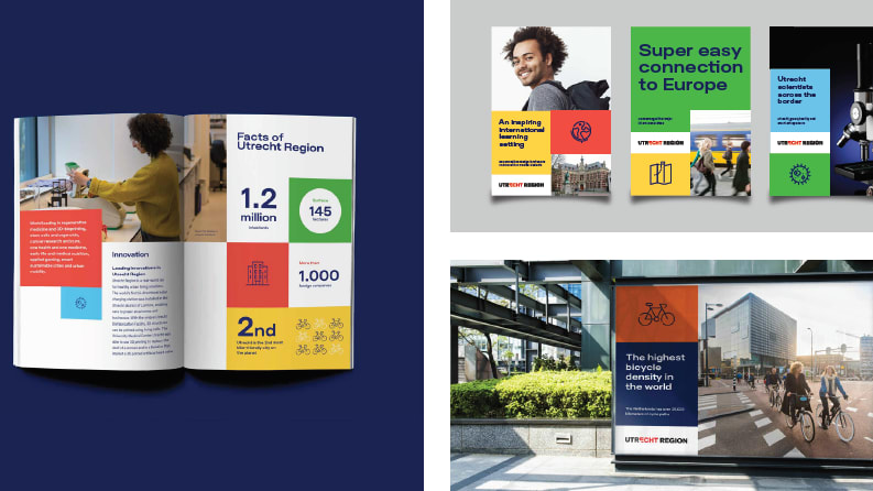
The Utrecht Region is located in the heart of the Netherlands and called home by over 1.2 million inhabitants living, working and studying in 26 very diverse municipalities and areas. The Utrecht Region is designated as the most competitive region of Europe (European Commission, 2016) when it comes to innovation, health, doing business and education. To maintain and excel its position in an ever-growing competitive world, the Utrecht Region needs to be highly distinctive but remain true to its identity. As far as external communications are concerned, the challenge is to interest and attract talent, businesses, innovation leaders and investors to come and settle in the Region. The Region has a lot to offer, but it seems to be too modest in communicating its USPs and not used to creating cross-overs in its communication. Since the biggest city (Utrecht) bears the same name as the Province and the Region, the internal difficulty is to overcome local sentiment. Instead of collaborating together, the smaller municipalities tend to interpret the city of Utrecht as an authority. In order to make a change on the international playing field, the local marketing teams need to team up and form a strong alliance.


Building the foundation

The potential of the Utrecht Region is huge. It’s a hidden gem, with lots to offer, but no platform to communicate it. With new trade missions coming up, and growing chances for business and investment opportunities, Utrecht Marketing forged a plan to create a substantive foundation across all stakeholders in the Region (majors, entrepreneurs, professionals, DMO's etc…) 

They needed to engineer a high-level communication plan, including budget indications, look for proper funding, develop a distinctive brand and learn, optimize and improve. The goal was to create an outstanding brand for three reasons. First and foremost, to connect all stakeholders, make them feel proud and enthusiastic. Give them the tools to unify their financial means, time and effort into one solid statement. Second, to create a platform for the Region to present itself to the world. And finally, to define what sets the Region apart from its competitors.

Needless to say - as this goes for all public entities - one of the main objectives was to stay within budget. By the end of 2017, the team of Utrecht Marketing started a soft lobbying offence to create enthusiasm and support under local stakeholders for the collaboration. From there, funding and financial means were initiated so a unifying brand could be developed. The brand strategy was quickly focused on three key aspects: Distinctive; Credible; Relevant. By researching what these key aspects mean for the Region, the team were able to pinpoint exactly what makes it different and how that can be used to gain an advantage. At the same time this would be a substantive base, easy to be translated into a visual appearance.


Connecting stakeholders into the strategy

The team were very much depending on the help and effort of local stakeholders and have held numerous working sessions to explore the creative directions in brand development. One of the outcomes from these sessions had a more practical focus. The stakeholders wanted the branding to be easy to adapt and workable by their own people. This was the main request that was taken into consideration during the design process, which involved the testing of colour palettes, typography, photography and image styles. The biggest internal challenge was to get everybody aligned into one central big-idea. Since the Utrecht Region is far spread and covers many villages and cities, everybody has different interpretations, emotions, and reasoning. In the end, the team focused on “Healthy Urban Living”, the central message of the Region which sets it apart from other regions. Once everybody embraced this idea, the creation process was started to bring it to life. 

The new identity for the Region has now been adapted to all communication expressions under the Utrecht Region-brand (i.e. trade, invest, talent, conventions, start-ups) and response from all stakeholders and the public is very good. The brand identity is reflected in the colour palette, which embraces the ‘Healthy Urban Living’-philosophy. The characteristic, ownable typography expands - just like the region itself. The distinctive grid, used to lay-out all communication expressions, is a very easy to apply system which makes it scalable and accessible for multiple suppliers. All local marketing teams have received a full branding kit from the Utrecht Region to work with.

Since the launch of the new branding the Utrecht Region has welcomed over 5000 expats, and more than 20 new international businesses that have created over 1000 jobs.


Related reading:

Using digital data to adapt to a changing travel landscape

Three keys as we rethink, retool, reinvent

Accelerating FDI through the strategic power of collaboration

Can place branding save the world? | Simon Anholt

Six tips to be more cost-effective as a place brand and marketing organisation

City Nation Place Americas 2023

Join us in New Orleans this June 7-8th

Find out more

Measuring the impact of place branding on place economies

Join this free webinar to identify the factors that build perceptions of nation brands

REGISTER HERE
share