VisitPITTSBURGH New Brand Identity
Entered by: VisitPITTSBURGH
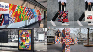
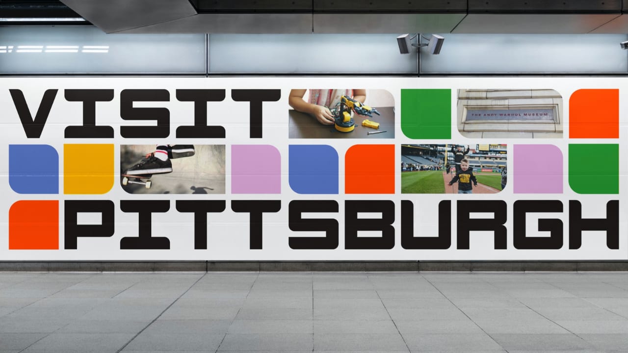
The pause in tourism caused by the global pandemic provided the perfect opportunity for Pittsburgh, PA, to re-examine the destination's brand. Long known as 'The City of Bridges' (they have more than 400 of them), 'Steel City', or 'The City of Champions' for their beloved sports teams, they were also saddled with a reputation as just another tired Rust Belt City. The destination's brand identity was overwhelming black-and-gold; the DMO logo depicted one of our 400 bridges, and the messaging leaned into Pittsburgh’s industrial past. They'd be living with the same logo for more than 20 years.
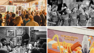
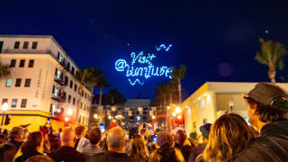
The team recognised that post-pandemic tourism recovery was going to hinge on rebranding the destination to reflect its 21st-century diversity of assets, 90 largely unknown neighbourhoods, and vibrant, welcoming population. They were their own best-kept-secret, with a wealth of arts and culture, culinary and craft beverage, history, and heritage to share. It was time to tell the world...but how?
To access please sign in.


