The New Urban Assets
Richard Florida argues for investing in people and in places to avert the urban crisis caused by growing inequality which threatens cities’ very existence. We agree. The keys to well-run and equitable cities are of course multiple: progressive wage policies, smart zoning codes that allow for plentiful and quality housing, and good transportation options. But, how—and how well—the city is communicated can play a part. As designers, we are attuned to the visual representations of the city, how these can support a sense of place, and how they can appeal to people from within and without the city.
Consider the face of all of communications coming from the public sector. The point at which the resident or visitor uses transit, reads a street sign or other way finding, the information posted about an upcoming event, the visitor or city website or even the pest control truck. All of this represents an important part of a place’s brand – every snippet of communication says something about that city and how it views its residents, its visitors, and their needs. And, unlike social media or branding activities that rely on media coverage, visual identity is often entirely within the control of the public sector and its subsidiaries.
Creative Placemaking utilizes community art, boosts quality of place and allows people to connect with their place and each other in a meaningful way. Place branders should consider graphic design as a device in their toolkit: creating an iconic visual language can boost their place's brand and increase community cohesion– new urban assets.
Typography
From the 1960s, Helvetica gradually took over the New York subway system. Supported by Massimo Vignelli, it has seeped into the visual language of New York itself.

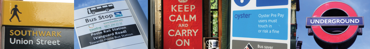
London Underground's use of the Johnston typeface spans more than a century. Originally adopted for clarity, it’s now an icon used for cultural impact.
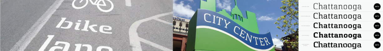
‘Chatype’ is the America’s first purpose-made city typeface. Funded by a Kickstarter rather than the Chattanoogan government, it’s apolitical and grassroots, yet adopted by the public sector.
Colorado’s state branding effort was created inclusively and is used all over state government, as well as licensing for Colorado-made products.

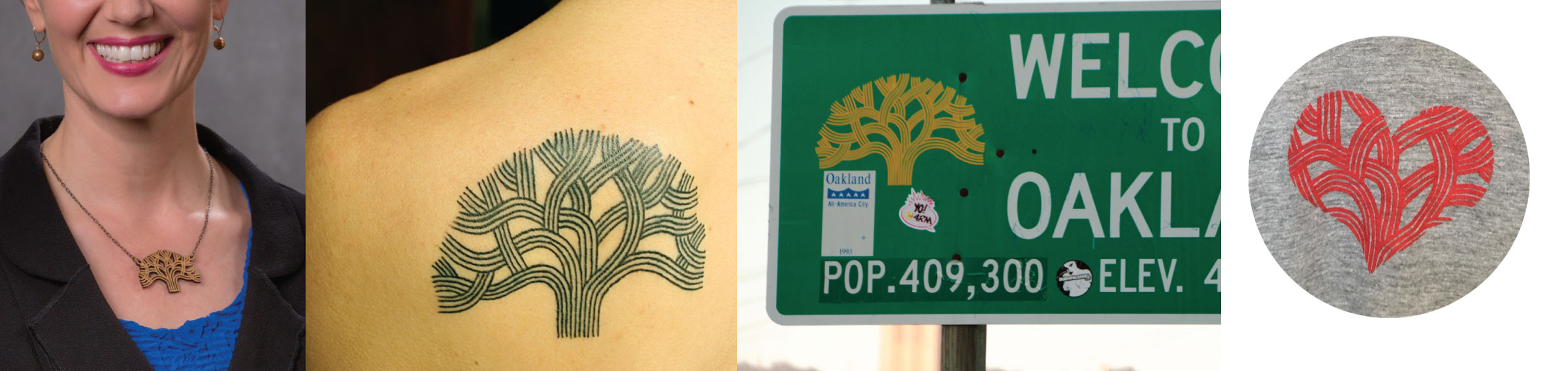
Graphic design is full of iconic opportunity. From typefaces to logos, color palettes and graphic aids, good quality visual systems, rooted in their community and leveraging local meaning can create something for people and place to coalesce around. When a place’s symbol (as we saw in the use of the tree when refreshing Oakland’s visual identity) or typeface is adopted by third parties, t-shirt printers and even tattoo artists, you can be sure that it works for that community. And these new urban assets could end up costing a lot less, and lasting much longer, than an extensive marketing strategy.
 A word to the wise
A word of warning, however. Too often a place’s branding efforts focus on attracting visitors, yet don’t work for the people already living there. Recent surges in populism shows what happens when large swathes of the population don’t feel like they are being listened to, and so a place brand and its visual representation should connect a place with its residents, or risk further alienation. We recommend that all public-facing parts of city and place governments – including its tourism arm –be branded together. In small and mid-size cities particularly, this increases brand equity by updating the urban assets under your very nose –creating satisfaction with your residents and recognition with your visitors.
Author: ![]()